This is the fourth post in a series on building business process automation at scale. Infrastructure. Automation. Where automation fails. This time: how you actually measure whether it works — with real ad tech data.
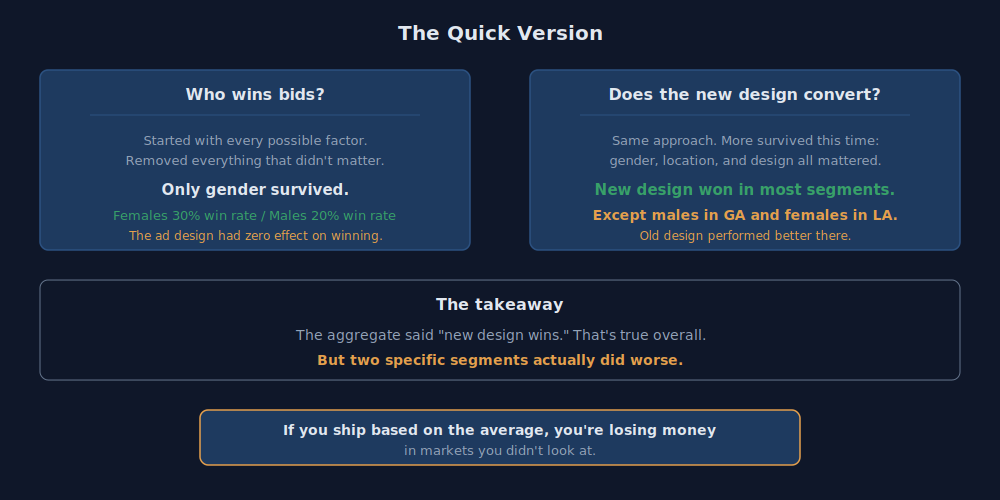
The short version: We A/B tested two ad designs across 585K bids in 11 states. The aggregate said the new design wins. But when we broke it down by segment, two groups — males in Georgia and females in Louisiana — actually converted better on the old design. If you ship based on the average, you're losing money in markets you didn't look at. The full analysis is below.
In my last post I said the value chain is only as good as the model. Here's what that looks like when you actually measure it.
This is real ad tech work — a mobile advertising campaign running on real-time bidding exchanges in the Southeast United States. Two ad designs. 585,000 bid records. 63,000 unique users across 11 states. The client wanted to know: is the new design better?
The aggregate said yes. The segments said not always.
How RTB Works
Real-time bidding exchanges are the backbone of programmatic advertising. A webpage or mobile app submits a bid request to potential advertisers. If a request comes in for a user that matches the campaign's targeting criteria, a bid is placed for an ad placement. Win the bid, serve the ad, and you have a shot at converting the user to a sale.
The client ran two designs against the same audience: a baseline using their previous campaign creative, and a new design that prominently displayed the offer. The questions were straightforward:
- Does the new design increase conversions?
- Are win rates different across demographic groups?
The Data
585,339 bid records joined across two datasets — user attributes (age, gender, location, test/control group) and bid history (timestamp, bid attempt, win, conversion).
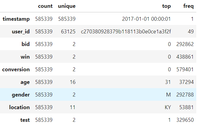
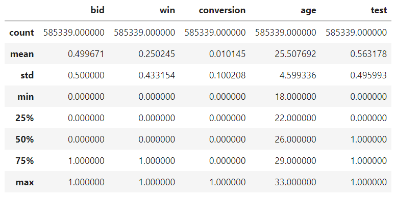
A few things jump out immediately. The win rate sits around 25%. The conversion rate is about 1%. The data is heavily imbalanced — most bids are losses, most impressions don't convert. That's normal for RTB. The age range is 18-33, skewing young. Gender splits roughly even. The test group is slightly larger than control (56% vs 44%).
The predictors:
- Age — continuous, 18-33
- Gender — M/F
- Location — AL, AR, FL, GA, KY, LA, MS, NC, SC, TN, VA
- Test — 0 (baseline design) or 1 (new design)
Two binary responses: win (bid won or not) and conversion (user converted or not). We modeled them separately — a conversion can't happen without first winning the bid.
The Approach
We built a model that predicts yes/no outcomes — did the bid win? did the user convert? — based on who saw the ad, where they were, and which design they got. We started with every possible combination of factors and then removed the ones that didn't actually matter, one at a time.
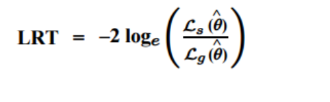
The tool for deciding what to remove is the likelihood ratio test. In plain English: this formula measures whether removing a factor from the model actually makes it worse. If it doesn't, that factor wasn't doing anything useful and gets cut.
Win Model: Who Wins Bids?
We started with every possible factor — age, gender, location, ad design, and every combination of them — and asked: which of these actually predict whether a bid wins? Then we removed everything that didn't matter.
The table below shows the starting point. The key column is the far right — "Prob>ChiSq." Numbers below 0.05 mean that factor matters. Notice how almost nothing is significant except gender:
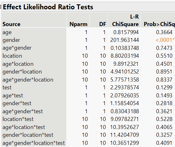
We removed the non-significant factors one by one. Age — gone. Location — gone. Ad design — gone. Every interaction — gone. After reduction, one predictor remained: gender.
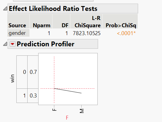
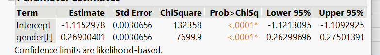
These are the model's actual weights — the numbers it uses to calculate the probabilities below:
The simplified model produces these probabilities:
| Gender | P(Win) | P(Loss) |
|---|---|---|
| Male | 20.0% | 80.0% |
| Female | 30.0% | 70.0% |
Females are roughly 10% more likely to be a winning bid. The model was significant at p < .0001.
The important finding: the ad design had zero effect on win rate. Whether you ran the baseline or the new creative, your probability of winning the bid was the same. The audience determines the win, not the creative. This makes sense — the ad creative isn't shown until after the bid is won. The exchange is making the allocation decision based on the bid amount and targeting parameters, not the ad content.
Conversion Model: Does the New Design Convert?
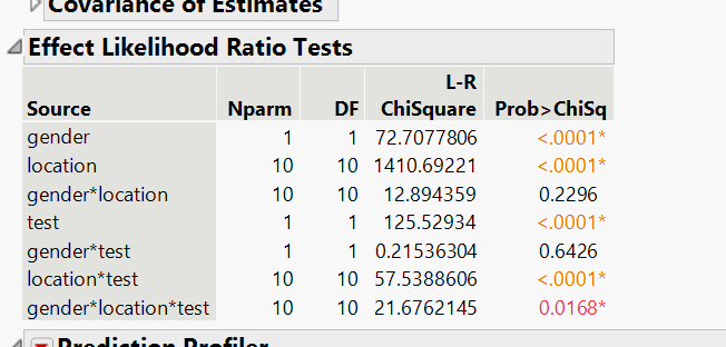
Same approach — start with everything, remove what doesn't matter. But this time, a lot more survived.
The table below tells a different story than the win model. Look at the right column — many more factors show significance (the orange numbers below 0.05). Gender, location, the ad design, and several combinations of them all matter:
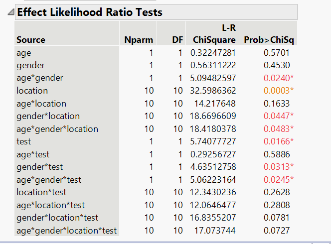
After simplification, what remained is: gender, location, the ad design, and their interactions — meaning the effect of the new design depends on who is seeing it and where they are. Age dropped out entirely.
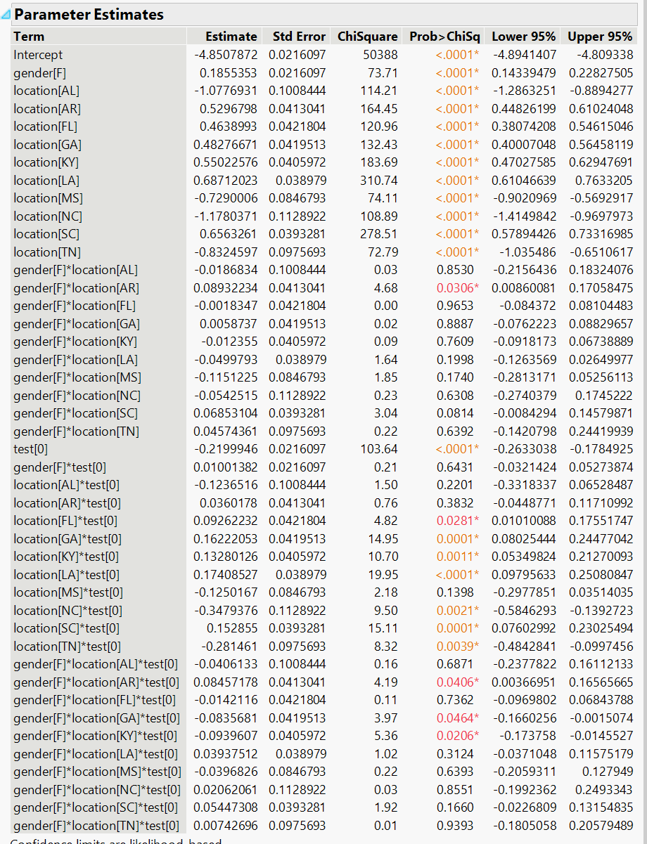
The full model weights are below. This is the math behind the probability table that follows — each row represents a specific combination of gender, state, and ad design:
Here are the actual conversion rates for every combination. The bolded rows are where the old design beat the new one:
| Gender | Location | P(Convert) Baseline | P(Convert) New Design | Difference |
|---|---|---|---|---|
| F | AL | 0.22% | 0.46% | +0.24% |
| F | AR | 1.57% | 1.88% | +0.30% |
| F | FL | 1.29% | 1.68% | +0.38% |
| F | GA | 1.33% | 1.72% | +0.39% |
| F | KY | 1.34% | 1.88% | +0.54% |
| F | LA | 1.76% | 1.74% | -0.01% |
| F | MS | 0.28% | 0.59% | +0.31% |
| F | NC | 0.16% | 0.47% | +0.31% |
| F | SC | — | — | — |
| F | TN | 0.26% | 0.69% | +0.43% |
| M | AL | 0.16% | 0.31% | +0.14% |
| M | AR | 0.76% | 1.32% | +0.56% |
| M | FL | 0.91% | 1.16% | +0.25% |
| M | GA | 1.05% | 1.02% | -0.03% |
| M | KY | 1.12% | 1.13% | +0.01% |
| M | LA | 1.22% | 1.47% | +0.25% |
| M | MS | 0.26% | 0.48% | +0.22% |
| M | NC | 0.12% | 0.38% | +0.27% |
| M | SC | 1.01% | 1.32% | +0.30% |
| M | TN | 0.16% | 0.45% | +0.29% |
The new design improves conversion in nearly every segment. Except two: females in Louisiana and males in Georgia. In those segments, the old design performed better.
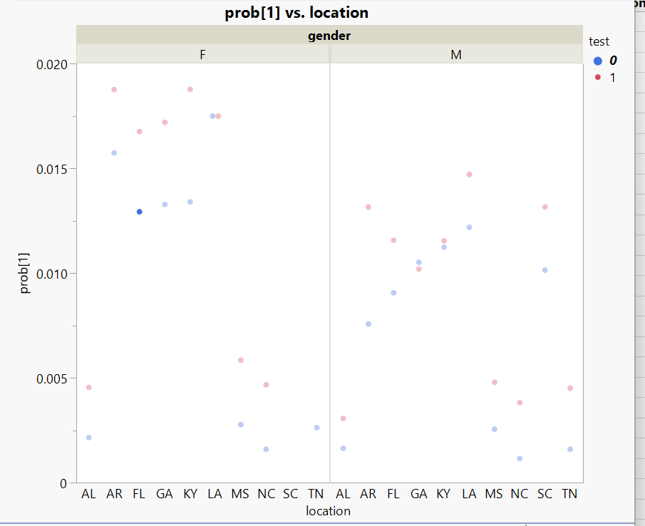
The scatter plot makes it obvious. In most segments the red dots (new design) sit above the blue dots (baseline). But in LA for females and GA for males, they don't.
What This Actually Means
If you only looked at the aggregate conversion rate, the answer is simple: ship the new design. It wins overall. But "overall" hides real performance differences at the segment level.
The new design works — except where it doesn't. And "where it doesn't" maps to specific combinations of gender and geography that the aggregate would never surface. A product manager looking at the top-line number ships confidently. A practitioner who segments the data ships selectively.
This is the same problem I described in the 80% post. An aggregate accuracy number is meaningless if you don't know which segments are failing. "The agents work at 80%" doesn't tell you whether parked domains are at 50% and Fortune 500 companies are at 99%. "The new design converts better" doesn't tell you that females in Louisiana actually convert worse.
The discipline is the same whether you're testing ad creative or validating AI agents: segment your results. The aggregate lies.
The Series So Far
This series has been building one argument across four posts:
- The Sovereign Stack — own your infrastructure, own your data. The foundation everything else runs on. Business value: cut infrastructure costs by an order of magnitude while keeping enterprise-grade capabilities.
- Know Your Business — build automation that processes at scale. 1,900 companies a day, eight signals each. Business value: reduce per-company research from hours to seconds.
- The 80% Problem — automation has a ceiling. The same 80-90% rule we've always faced in BPM and workflow. Speed without accuracy is just making mistakes faster. Business value: design the handoff so the human only touches the 20% that actually needs judgment.
- This post — measure it. Don't trust the aggregate. Segment your results or you're flying blind. Business value: know exactly where your system works and where it doesn't before you ship.
The thread connecting all of them: deterministic rules, statistical validation, and machine learning aren't competing approaches — they're layers. Rules handle the clear cases. Stats tell you where the rules break. ML pushes the boundary on the ambiguous middle.
What's Next
We proved significance with statistical modeling — we know the new design works and we know where it doesn't. But stats answers "is there a difference?" It doesn't answer "what's driving it?" or "can we predict it?"
In the next post, we take the same dataset and build neural network models. Same data, different question — and the ML surfaces something the logistic regression couldn't: the new design didn't just convert better, it changed how conversions happen.
Get in touch if you're working on similar problems.